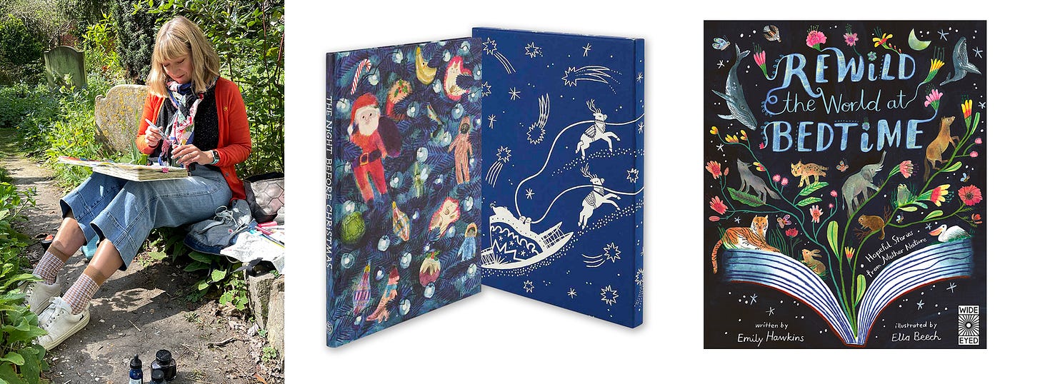
Hi! Are you new here? Here’s a little bit about me. I'm Ella Beech, a children's book author and illustrator living in Cambridge UK. In 2019, after over 20 years working in Children’s Publishing as a Designer and Art Director I realised I wanted to follow my lifelong dream to become an artist and illustrator. I quit my job, enrolled on the MA in Children’s Book Illustration at Cambridge School of Art, and immersed myself in a brand new creative practice. Since then I have graduated, and illustrated three books, with The Folio Society, Wide Eyed Editions and Thames and Hudson. I also teach on the MA now part-time as an associate lecturer.
Art Club is a monthly online meet-up designed to help you let go of your logical thinking brain and make some intuitive, playful and free-flowing art. Each month I choose a theme (some months I keep it loose, sometimes quite specific) and I lead you through an hour-long art-making session on Zoom. All recordings are available as replays.
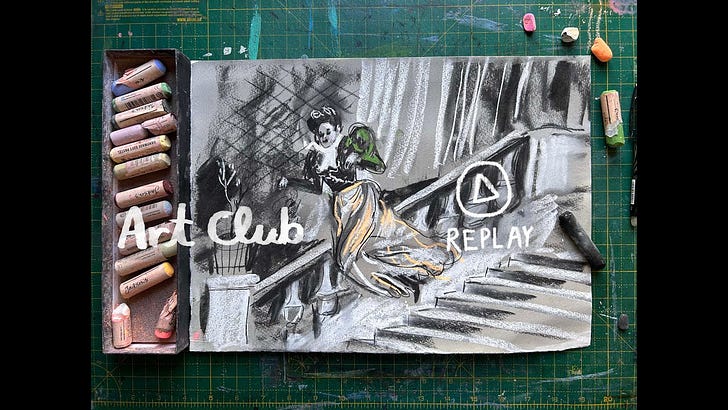
Hello! I am here with the Replay from Wednesday’s Art Club, which was inspired The Impressionists on Paper exhibition I saw recently at The Royal Academy.
Sorry I am uploading it a little late - I was teaching on Thursday and Friday, and I am always wiped afterwards, and I have been feeling off-colour all weekend. But I wanted to get this up for you, as I know this is good weekend viewing.
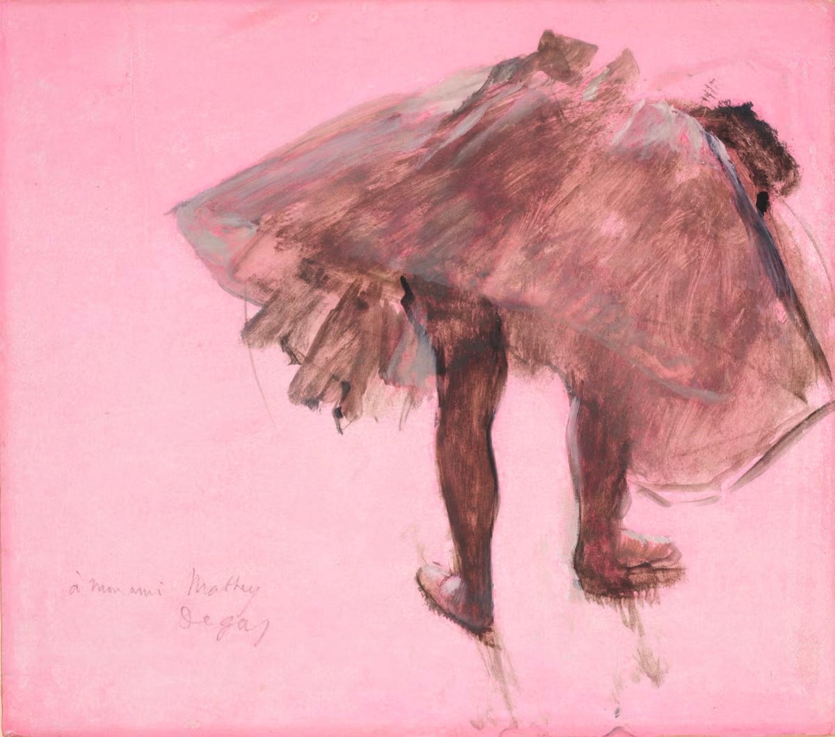
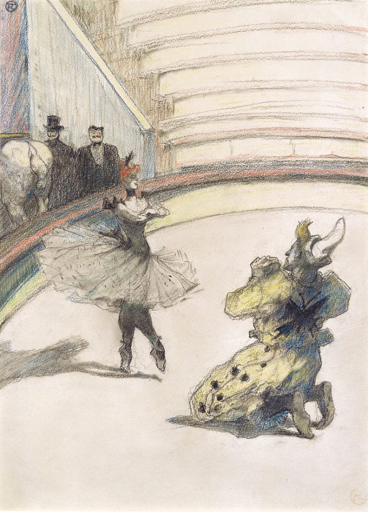
Despite all the beautiful colours I saw at the show, when it came to Art Club, this image (below) by Degas, was in my head. As I explain below, there was something niggling in me that wanted to try the additive white and darks. I think it’s such a clever way of working. What I made (on the right) feels too much of a cool grey now I look at it, but I really enjoyed thinking about the image in that way. I did lots of eye squinting, as you will hear in the replay, and it ticked my nerdy artist fancy to work on the image by working on it looking at the lights and darks, and creating shapes from that, rather than drawing it - it’s such an exciting and interesting way to draw (and I think can really improve your drawing technique). Instead of drawing the things you are looking at (hands, nose, hat etc) draw the shapes, lights and darks, negative space, look at how they all match up together, like a jigsaw puzzle, and like magic, you create an image! I talk to the students on the MA all the time about it - draw what you see, not what you think you see.


Would you like to buy the piece? Send me a message and we can arrange.
380 x 280mm on Bockingford Hot Press Watercolour paper, 300gsm. £50 not including postage.
Here is all the info you need about this week, and the reply is below, for paid subscribers.
THEME?
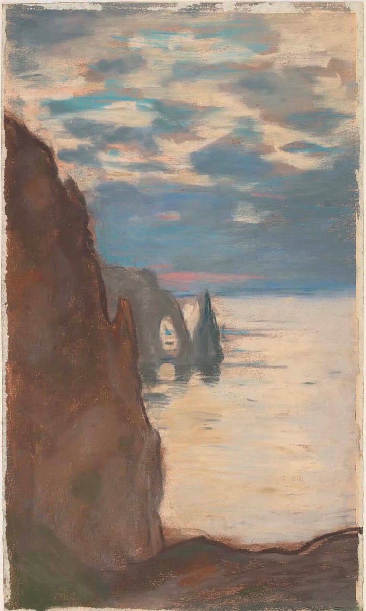
I went to the Impressionists on Paper exhibition recently and got super inspired by it. I will always have a soft spot for The Impressionists - my adolescent heart was captured by them, and they feel like an artistic home for me. In this exhibition, as the name suggests, all the art was made on paper, so it felt especially exciting because it felt like you could really give it a go. Sometimes I go to an exhibition of oil paintings, and I might be captured by the brush strokes, colour, mark-making, but it feels like a leap to find something I can take into my one practice, whereas with this exhibition I left feeling like - I want to try this and this and this…!
So it feels like a perfect thing to take as inspiration for this month. Here are the things I used as inspiration for this month’s Art Club:
playing with soft pastels - I’ve had some fun playing with them before, but I wanted to come back to them again. I enjoyed playing around with them, particularly in the warm-up. Something I will come back to, for sure.
mid-tone grounds - I was particularly excited by the idea of using them on a mid-tone ground, as inspired by lots of the work in the exhibition.
additive lights and darks - I was excited by mid-tone paper, because I wanted to play around with adding lights/whites. Normally I enjoy using negative space for the whites on the page, so this was a different challenge for me, but I do it sometimes when I am painting on location and I always find it exciting. I thought we could be extra creative and work on some pre-prepared mid-tone grounds (see materials below). As you will see in the replay, I prepared some very grey grounds, and in retrospect, I wish I had prepared some brighter colours. Something to think about for the future.
colour - obviously, the impressionists are famous for their use of colour, so I was inspired to think about interesting ways to can use colour, inspired by the impressionists. I was thinking particularly about how you can create light and shade with colour (so playing with colour value, for colour nerds)


MATERIALS:
You will need:
- paper - ideally A3 or bigger - this time, prepare some sheets with a mid-tone ground.
- art materials - Soft pastels (aka chalk pastels) and charcoal. Just grab what you can, even if it is just a cheap packet from WHSmiths.
- I will definitely combine it will other art materials, so bring along a selection of other things you’d like to play with. Ideally, think about things that will be opaque (not transparent or sheer) so that they will stand out on the mid-tone paper (although a sheer wash could be nice too!). So you could being some gouache, arylic gouache, acrylic, coloured pancils, neocolour etc…
- I will post the picture we drew from below, for paid subscribers, but feel free to set up a still life, or choose your own picture if you prefer.
HOW:
I generally begin with a warm-up, to get you loose, and help you tap out of your thinking logical brain and working a bit more intuitively. I then begin work with the camera focused above my paper, talking you through my own experiments, which you can either join along with or go off-piste in your own direction.
I hope you enjoy the replay. Do let me know how you find it in the comments. I will set up a chat for you to post what you make!
Ella xx
Art Club is below for paid subscribers. This creative space that I call Gather • Filter • Make helps support me in so many ways. It means I have space to continue making personal work and personal creative development, It supports my work as a published illustrator (I can’t live on the advance payments alone) and helps fuel this Substack, so if you want to see more, I would love it if you would consider becoming a paid subscriber. As soon as you join you immediately get access to my back catalogue of paid posts, regular updates and behind-the-scenes videos from my studio. You also get exclusive access to my monthly lives: Art Club and Picture Book Club. Plus, access to my private community, chats and loads more


