Hello!
Welcome to day 4 of my Night Before Christmas posts. Today I want to bring some colour into the mix. I just looked through all of the work I made for the book, and it was amazing to look through it all again! What struck me as well as all the big changes I made to the spreads as I worked (such as changing compositions) was all the little tweaks, changes and adjustments I made, the many sketch revisions, trying to get a face right or perfect the composition.
It would take too long to go through it all, so I thought a good way of demonstrating it would be to take you through the process for one spread; it is one that I played around with a lot, and I didn’t make this many amends with all of the spreads. I guess it’s useful to say that this was towards the middle of painting the book, and one of the first with snow on the ground.
To rewind a bit… after the initial brainstorming, I got down to proper sketching. Looking back at my folders, I spent most of November and December last year sketching for the book. It was perfect to be sketching at Christmas, as I had all the inspiration I needed.
I started painting up the book in the new year and began with the second spread, which is of the sitting room, with the stockings hung by the fireplace. I remember that, as usual, I was super nervous about making artwork. I hadn’t painted anything properly since I completed my last project on the MA, almost exactly a year ago (you can see that artwork in this post). Luckily, I continued to paint and draw all year, setting myself various personal challenges and keeping up my regular sketchbook habit. You can see it all over on my Instagram if you’re interested. I hadn’t done loads of painting using the same process I discovered on the MA, but I’m glad that I set myself a few challenges to paint imaginative pieces like this one, and I also painted a school nativity for an online Christmas illustration challenge I was co-hosting, hosted by the lovely Ema Malyauka. So those did give me some confidence that it might be possible. When I painted the first spread, it just felt…right - I was so relieved, I can’t tell you! This is how it looked. There’s quite a big change to the final artwork, can you see what it is?1
So, after that, I continued to paint, and if I remember correctly, I completed the next three spreads at that pount. We then switched focus for a while, as the cover2 and slipcase artwork was due.
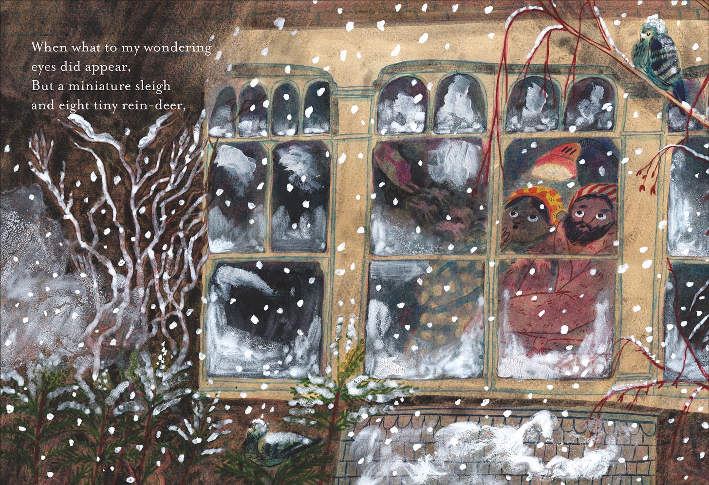
So, after I handed in the cover and slipcase, it was back to the artwork, and this time, the artwork deadline was on the horizon, and I had an intense few months of painting. And so we come to the spread I want to talk to you about today; the one where the text reads: When what to my wandering eyes should appear, but a miniature sleigh and eight tiny reindeer.
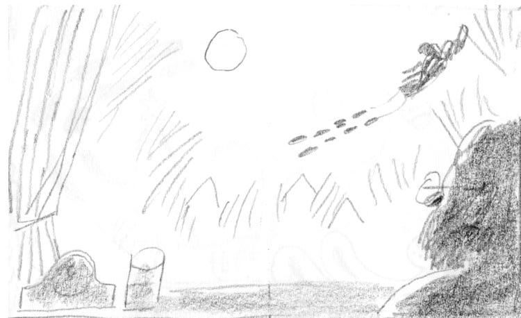
We had already seen the father spring to the window and tear open the shutter on a previous spread, so this was the one where the father, who is the narrator, sees Father Christmas for the first time. This shows one of my first sketch ideas for the scene.
Pretty quickly, I realised that the book would be quite dry with just the father taking part in the action, so I decided that I wanted to bring the mother, and later the children, into the book. So I began trying options showing both the parents.
It somehow didn’t feel right to see Father Christmas and his reindeer so soon - in chatting about exciting production values we could add to the book, we had decided to add a gatefold3 to the book when they are finally shown - so we wanted that to be a big moment of reveal! I want to take a moment to say how amazing The Folio Society were to work with. They want each book they produce to not only have beautiful artwork, but they want each book they publish to be a beautiful and special object. At the beginning of the project, the brilliant art director I worked with, Raquel, talked to me about this, and we discussed what we could do to make this book as special as possible. We eventually decided on the glow-in-the-dark slipcase and cover, and a gatefold reveal for the reindeer spread. How lucky am I?
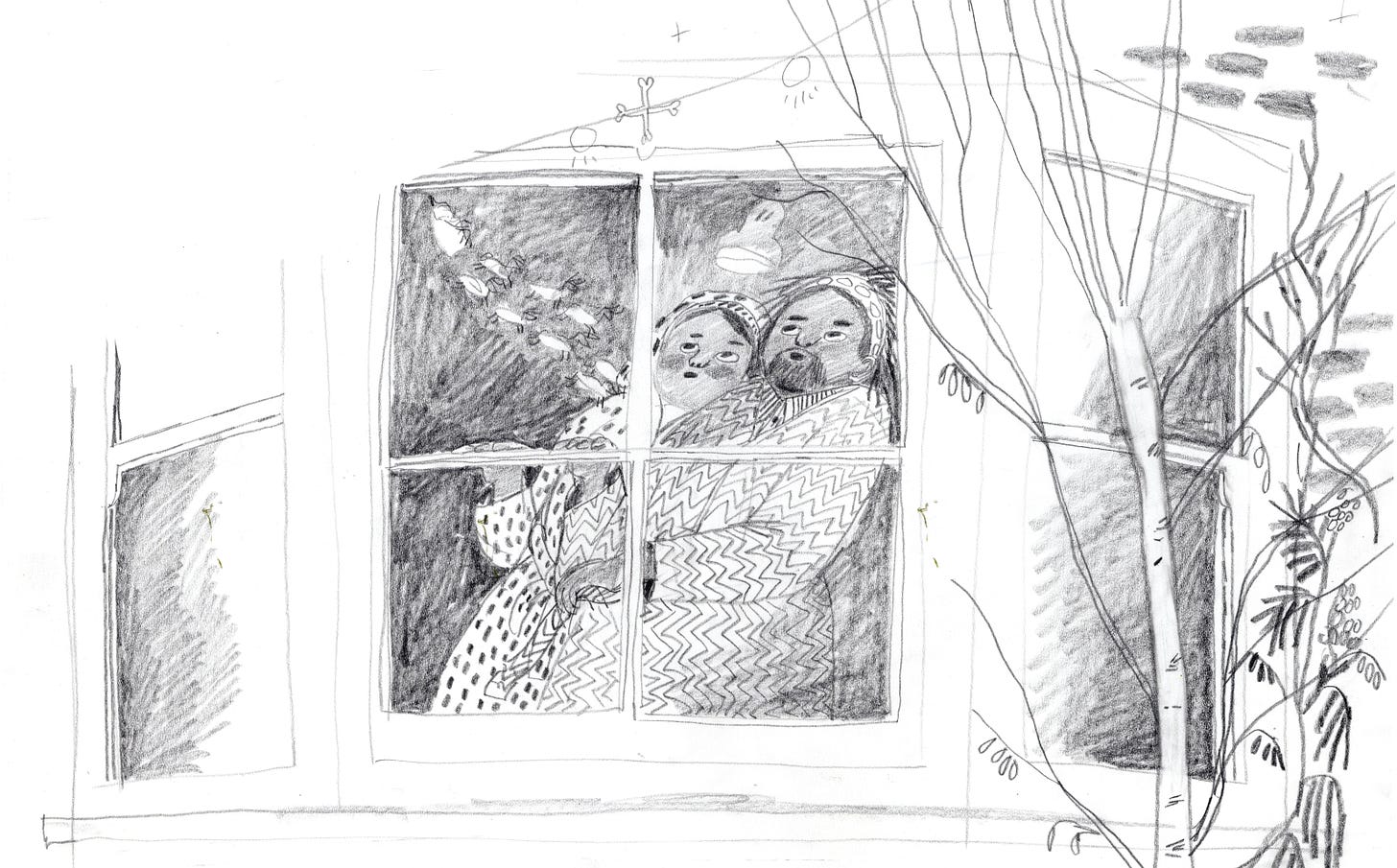
So, after deciding I didn’t want to show the Father Christmas and his reindeer too clearly, I wondered if this spread would be better if we saw the parent looking up at the sky instead with the reindeer reflected in the window.
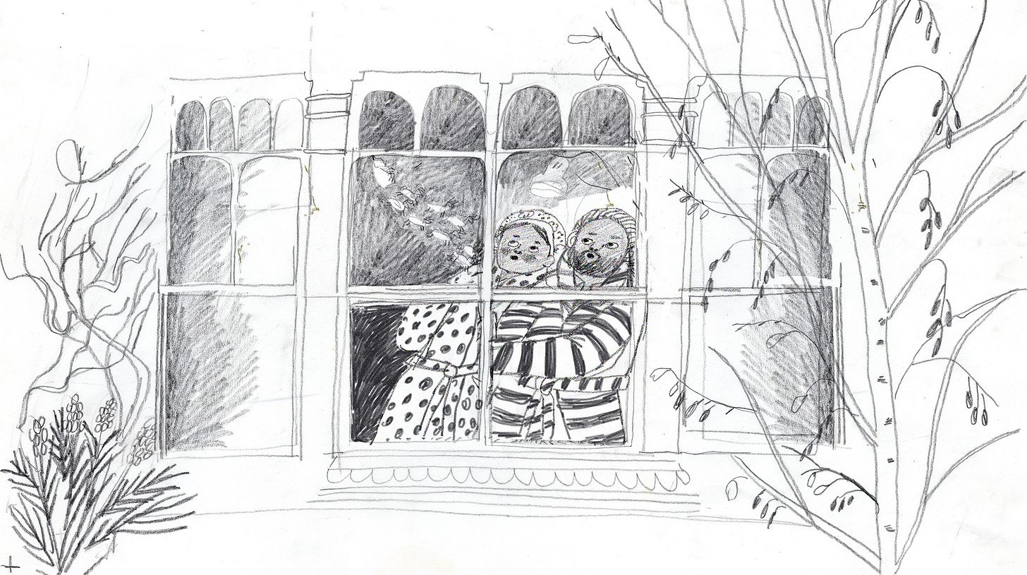
After that, I began refining it. Mum and dad’s characters changed a bit - dad got a sleep cap - and I played around with what the window would look like and which plants I would have.
My husband is an architectural historian and transferred his degree from architecture to history of halfway through, so I used him as a bit of a consultant on the window. I also had a memory of one of my old friend Jenny’s windows from when we were children. I always love little architectural details (like little window panes) and I wanted this window to be interesting to look at, so played around with it until it felt right.
The plants and trees are also personal - they are all ones I look at every day out of my window. The one at the bottom left is one we used to have in our front garden, and a few of our neighbours have them now; I believe they are called Mahonias. They flower in the winter and I thought that would be nice, even if it they are very frosty! Our neighbours opposite have Wisteria growing on the front of their house, and I love how in the winter, it just becomes a tangle of roots, so I added some roots on the front of the house. And finally, we have a Silver Birch growing right outside of my studio window, so I had one in my sketches for a long time. In the end, I decided to simplify and took it out. But for now, it was in the sketch.
So, all that was left for me to do was paint. Easy!
So… I had grand ideas for how I would do the snow. Before I painted this I played around a lot with different ways I might paint snow. I tried mixing granulation fluid with acrylic gouache, various ways of watering it down, spraying with water, I got obsessed with crackle paste for a while. Let me know if you want to see these and I can add a section into the Q&A video, there’s just not enough space here to show it all. Up until I added the snow, I had been fairly happily painting away, but the snow just felt wrong! At the same time, I had made the same mistake on another spread…
Nooo! This one was super frustrating, because I had put all the detail in, and it had all been working so nicely, and I had enjoyed doing dry brushing for the snow. But it was waaay too much!
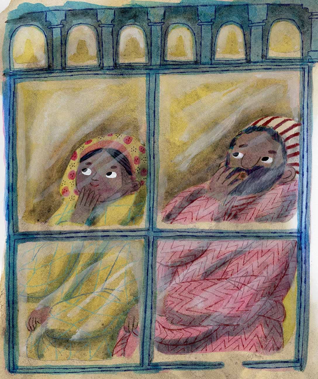
I knew I needed to figure out the snow, so I decided I would try some experiments. I wondered if it would work better as negative space, and I also suspected that although the textures are fun and I desperately wanted to be clever and creative, perhaps it would be better if I kept it as simple as possible...? So I painted up two experiments. One window where I painted the snow (below on the left) and one where I left the page white, using the negative space to represent it (below on the right).
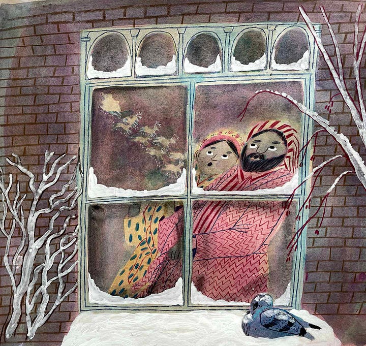
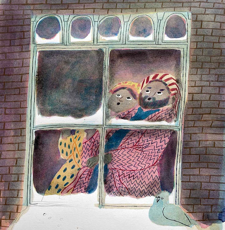
I knew straight away that I liked it much better as negative space (on the right). So that was one thing figured out…
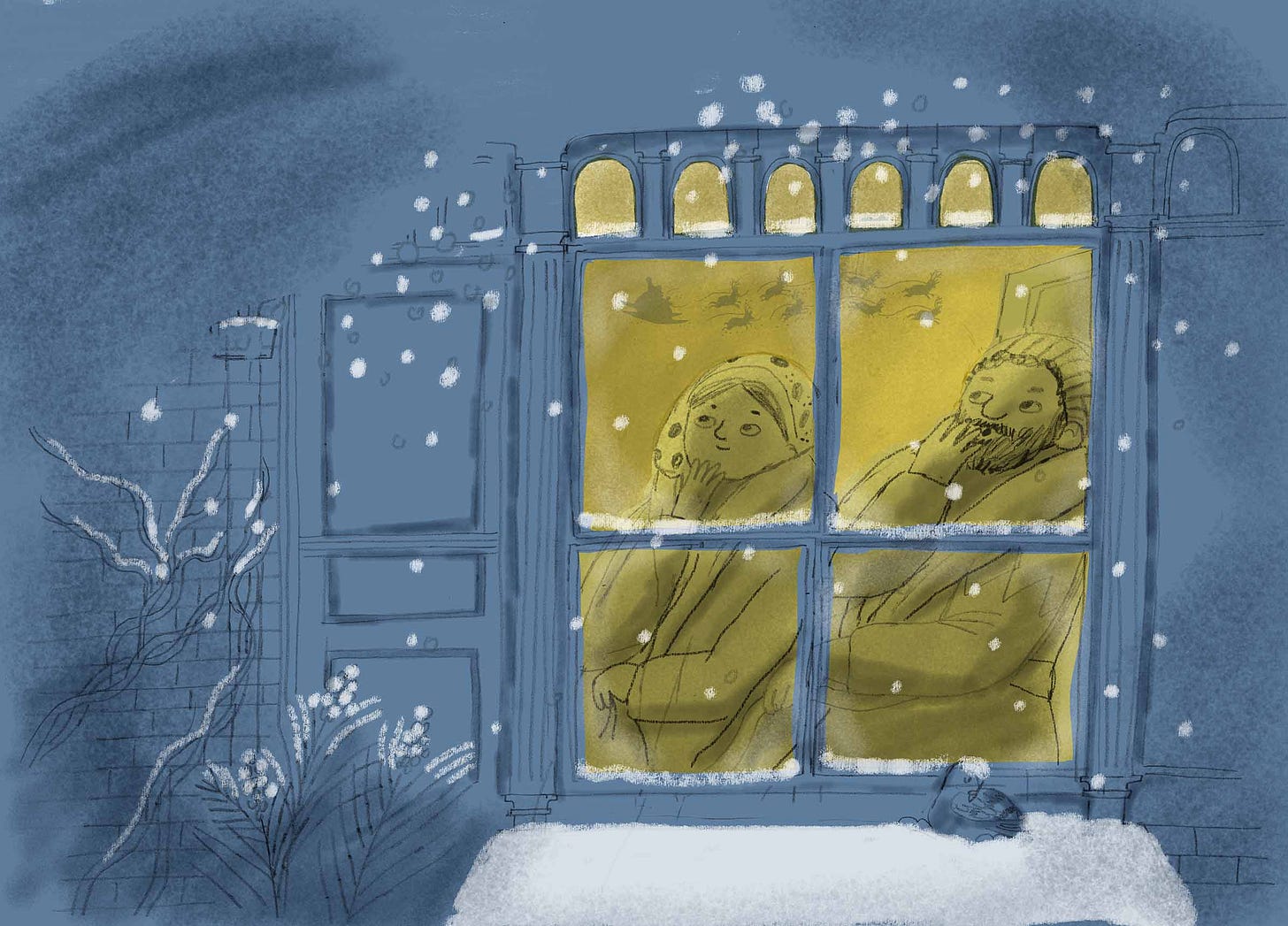
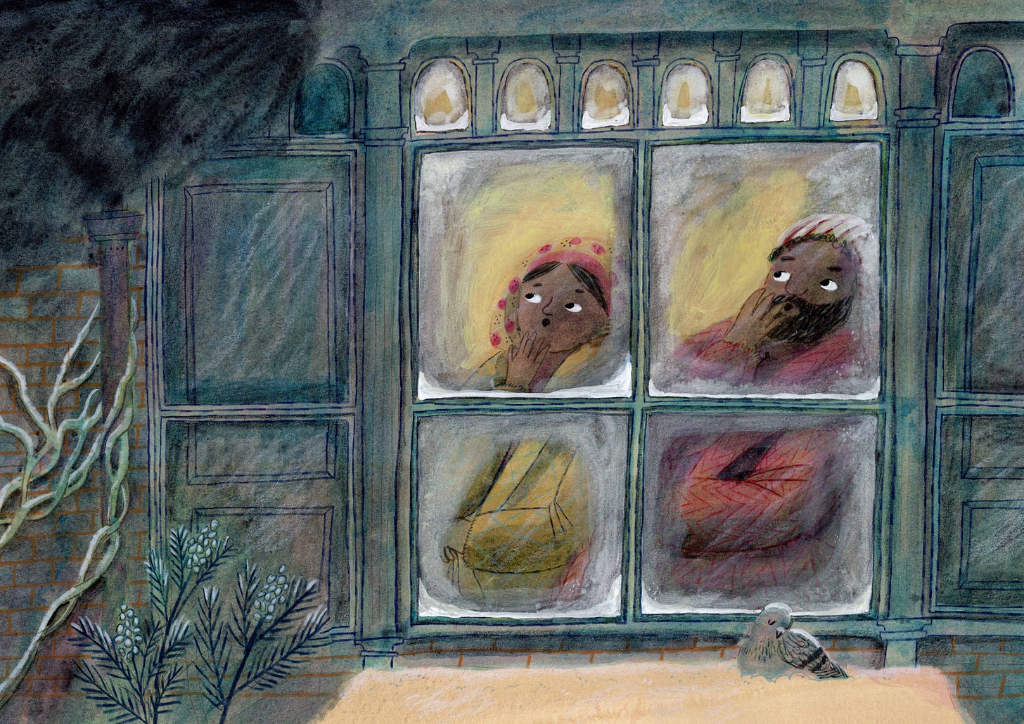
But there was one thing that was still bothering me. The scene was set at night, so I wanted the window to glow. I had been imagining that their bedroom was dark, or low light, so it wouldn’t be fully lit up, and it didn’t feel right to be so dark, so I tried a mock-up in ProCreate, with a lit-up window.
Once I had tried that, I also knew I wanted to keep the palette pretty limited, particularly on the outside. So I painted it up…
Now I talk it through, it feels ridiculous how slowly I was figuring all this out, but at the time it felt like I was juggling multiple things in my head, and I can kind of see why it happened. So, as you can see, I left the snow unpainted at the bottom (I paint on a sepia underwash, and for all the snow, I lightened it in Photoshop after painting, which is why it looks yellow here) but now I tried to “frost” the window!! I wasn’t happy with it! I also thought it was too much with both of them gasping.
So, as I was happy with the rest of the spread (the outside), I just painted the inside of the window again (you cand see where I have left it clear for snow, at the bottom of the windows).
After that, I put it all together in Photoshop and added snowflakes digitally. Adding Santa and his reindeer is another story, but after a fair few experiments, I added them in Photoshop from a silhouette I painted in black.
It’s unusual for me to piece images together like this. On the whole, I like to work on one piece altogether, but after all of this, it felt like it worked, and I didn’t want to repaint it and mess up something else. I also had to get on with the rest of the book! But that’s another story (post - do you like what I did there!?)
Wow! I’m exhausted after all of that, and supper is ready, so I am going to bid you a fond adieu, until tomorrow…
Ella xx
P.S. Do you have any questions…? anything I’ve not explained? My plan is to record a Q&A video about this book. If I can, I will do it before Christmas, if not, I’ll definitely do it in the period that is known as betwixtmas! If you want to ask privately, you can send an email with the subject line “Q&A” to ellabeechbooks@gmail.com. Thanks to those of you who have already sent questions. I have seen them, and noted them down. xx
Did you enjoy this? Please consider becoming a paid subscriber, it really helps support me in my illustration work. I am offering 20% off all paid subs until the end of the year. Subscribe below.
I repainted the tree as it was inconsistent with how I painted the tree later on, and added the sofe (where Santa sits) behind! I patched it in in Photoshop. I also changed where the text was placed.
The Folio Society call the cover the binding, but for the sake of this post, I will call it the cover.
a gatefold is when the pages open out to the side.




Morning Bells , I think it is completely fascinating how you can described be your work processes so articulately!! Watching the poem gradually taking shape visually is very well done... it has been drawn often before by well known illustrators but you have developed your own very personal depiction and produced a beautiful book. Also it is interesting to me that it has a particularly English flavour to it, the fire place and architecture look Victorian, with ‘William Morris’ type tiles.. a wonderful and enlightening description, well done!!!!!
Just sat down with a cuppa to catch up on all these great posts about behind the scenes of your new book. I LOVE hearing about different creative processes so thanks so much for the access all areas!
Question for your q&a - how did you approach the overall design of the book? Were you working with a designer to decide compositions and the overall flow of the book (what went on what page) or did you fly solo?
And placing text?
I’m feeling very inspired by the way you approached getting to know Santa...I have had such a block on character development so far but I’m determined to crack it 🙌 characters getting out of bed and eating brekkie seems like a great place to start 👍🏻😊